
FERGUSON ENTERPRISES GRAPHIC Designer III
Though many types of projects, both digital and print, found their way across my desk, my main focus was content creation for email and social media. During my time with Ferguson, I've created content like the video playing above using After Effects and the static imagery and print materials found below.
Though many types of projects, both digital and print, found their way across my desk, my main focus was content creation for email and social media. During my time with Ferguson, I've created content like the video playing above using After Effects and the static imagery and print materials found below.
I found myself diving into Adobe XD, Photoshop, After Effects, InDesign and Illustrator on a daily basis.
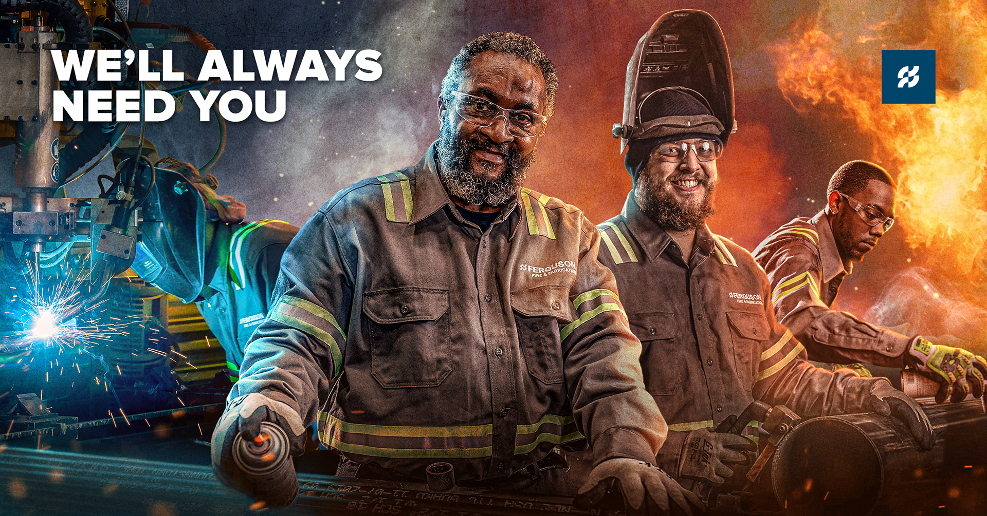
CASE STUDY: SOCIAL MEDIA - HUMOR AND VOICE
THE CHALLENGE
Finding an appropriate method to convey imagery and leverage humor in tasteful ways, if at all. While previous approaches to social media content creation included jokes for humor's sake and cartoonish imagery, we felt they did not accurately communicate the message and represent Ferguson Enterprises as a brand accurately.
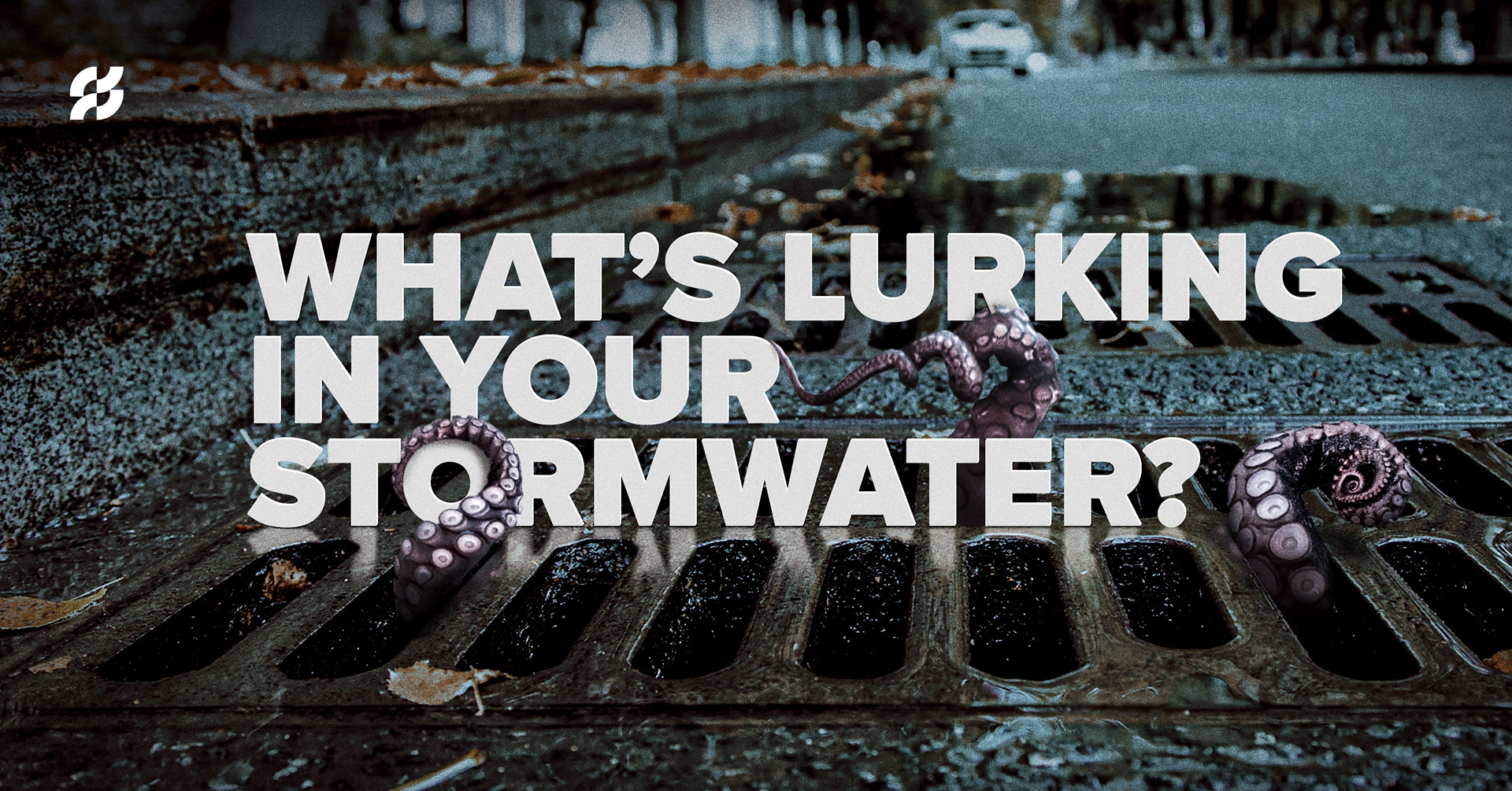
Old Imagery style
New Imagery style
SOLUTION
Instead, to become more like an industry sage in our space, we now leverage high quality photography and clean typography along with a more serious tone. We want to leverage humor if, and only if, it furthers the message we are trying to convey.
My role in creation of these images is collaborating extensively with our copy writers and creative team leads to come up with appropriate visions and pushing back when imagery requested of us from our customer groups approaches the realm of cartoons or humor for humor's sake. Presenting mockups and providing solutions grounded in solid design fundamentals to grab the viewers attention, communicate our message effectively and build a consistent sense of brand presence are the end goal for our teams.
In terms of artistic creation, I assembled these images in Photoshop by manipulating and compositing both stock and in house photography to create highly engaging, bold, gritty, realistic images that embody our brand positioning for our respective customer groups.


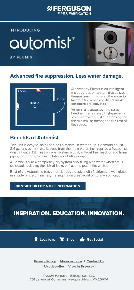
CASE STUDY: AUTOMIST & FERGUSON ENTERPRISES
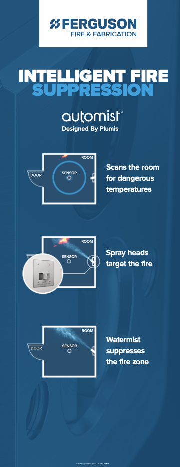
AUTOMIST BY PLUMIS
Automist, a revolutionary fire suppression system for homes and businesses, was poised to transform the market. With Ferguson as its exclusive first-year distributor, a strategic partnership and cohesive marketing campaign were critical. A comprehensive design strategy, spanning print and digital materials, was developed to launch Automist and establish its market presence.
THE CHALLENGE
The central challenge was to develop a visually compelling promotional campaign that struck a delicate balance: effectively showcasing Plumis's product while clearly highlighting Ferguson's role as a key distributor. We needed designs that resonated with our target audience without overshadowing Plumis's established brand identity.
SOLUTION
To solve for this and showcase how the product worked we had several deliverables set to support this initiative.
I applied Ferguson's brand standards, color palettes, typography, and imagery that reflected the product's innovation and reliability to each of them.
I applied Ferguson's brand standards, color palettes, typography, and imagery that reflected the product's innovation and reliability to each of them.
This established Ferguson clearly as the distributor while also showcasing the products capabilities.
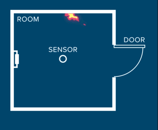
First, I designed the email in Adobe Xd creating an engaging hero image leveraging product photography provided to us by Plumis. I then created an explainer animation using After Effects to animate a simple illustration outlining the functions and exported it as a gif to use in the body of the email to show how the product worked.
For the print portion of the campaign, I designed a multipage brochure that again leveraged product photography from the manufacturer while utilizing large blocks of color and squares to frame the informational content. This made the information easier to digest, highly scannable and nodded to the products boxy like nature pulling together the composition.
Animation
Pop Up Banner
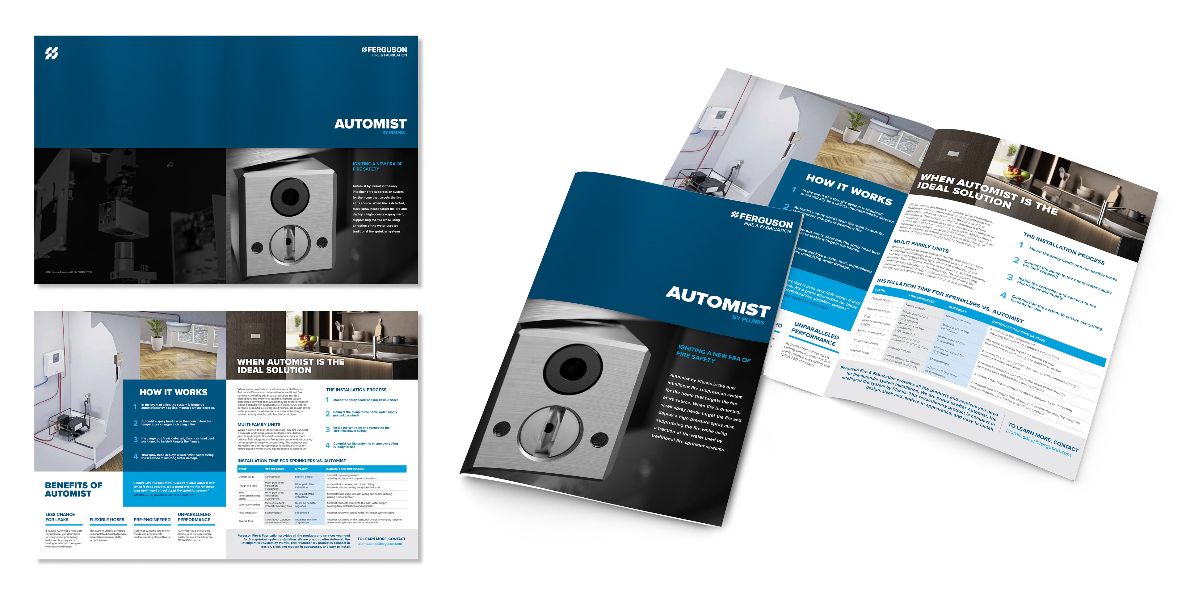
Brochure
PRINT
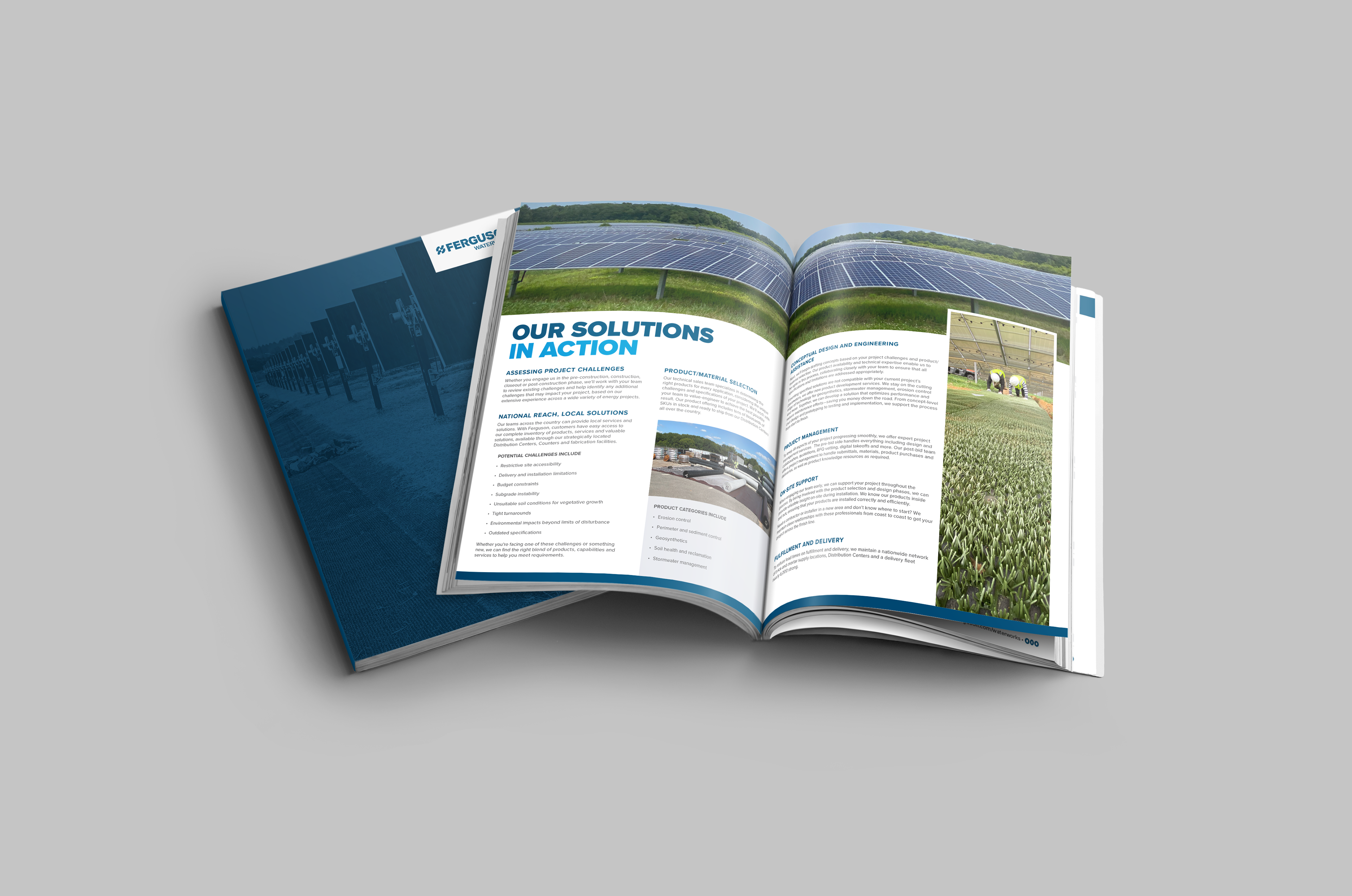
While my strength lies in digital content creation, I also have the skills to create eye-catching and impactful designs for various print materials. Whether it's clothing, brochures, flyers, posters, or business cards, I can create visually appealing layouts and select the right typography, colors, and imagery to convey your message effectively in the physical realm.
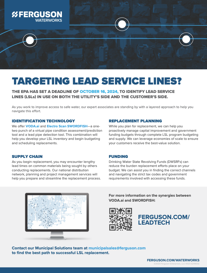
Flyers, Brochures and Mailers

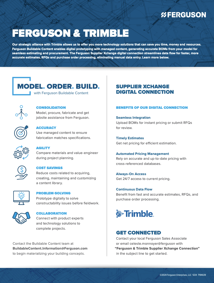

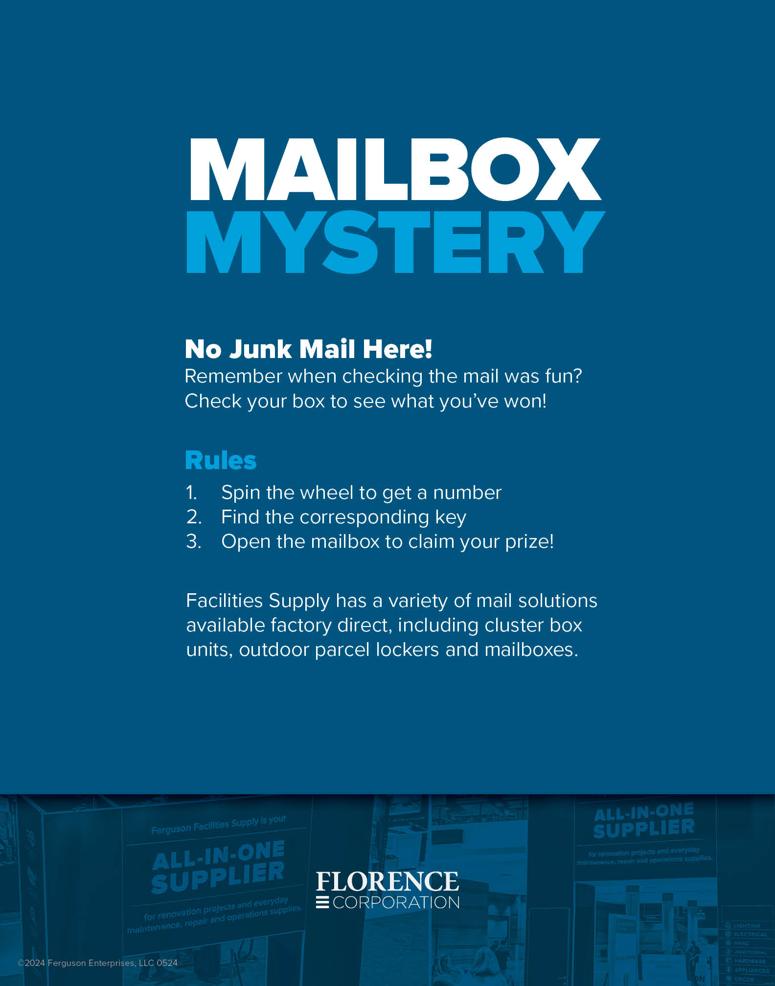

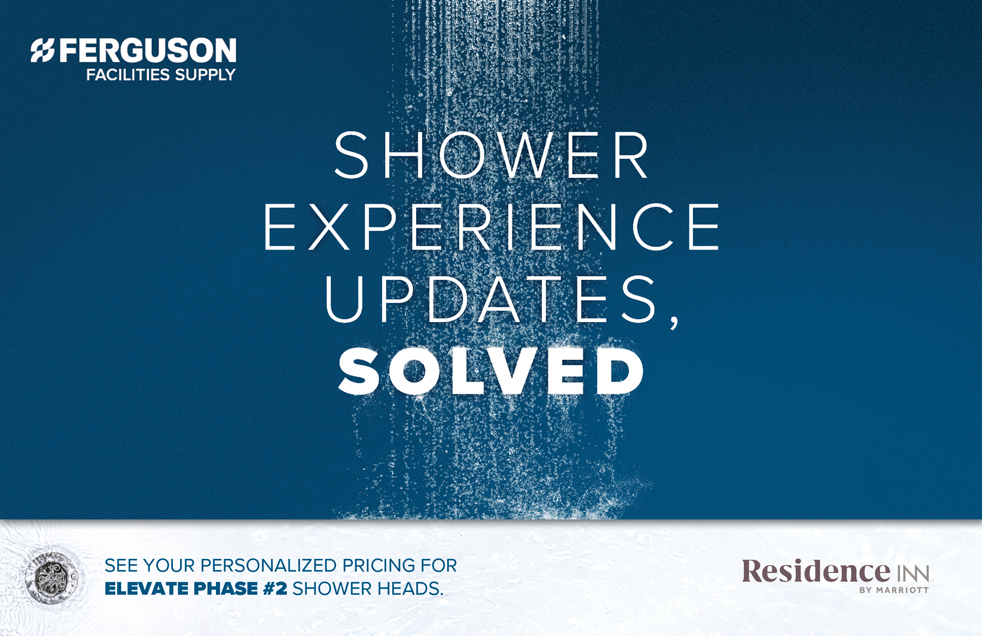
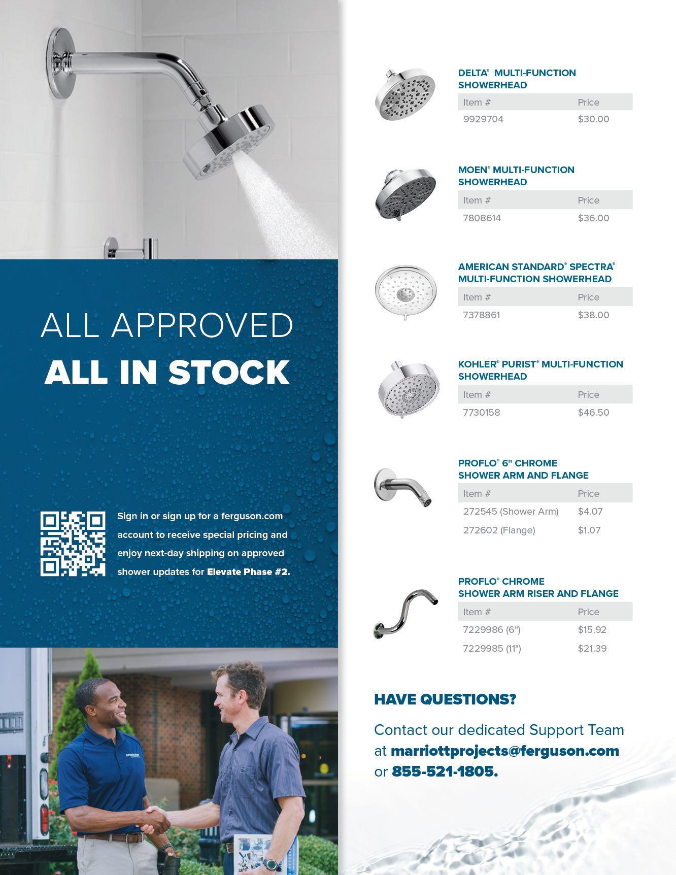
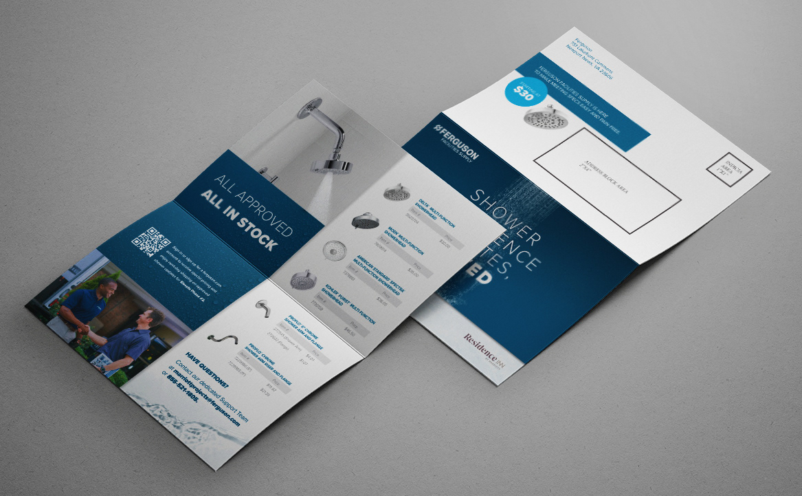
Ferguson Facilities Supply Promo Mailer
Developed a mailer to simplify Residence Inn's Elevate facilities upgrade process by showcasing curated and priced products available through Ferguson. The design, created in Photoshop, featured a composite image and compelling typography to encourage product sourcing through existing Ferguson accounts.
I wanted a very strong hero image to visually communicate our problem-solving capabilities for Residence Inn.
The design features the word "SOLVED" being "showered" with water against our brand's blue background, incorporating stock photography, painted water textures, and imagery of draining water to reinforce the message of a luxurious and clean customer experience.

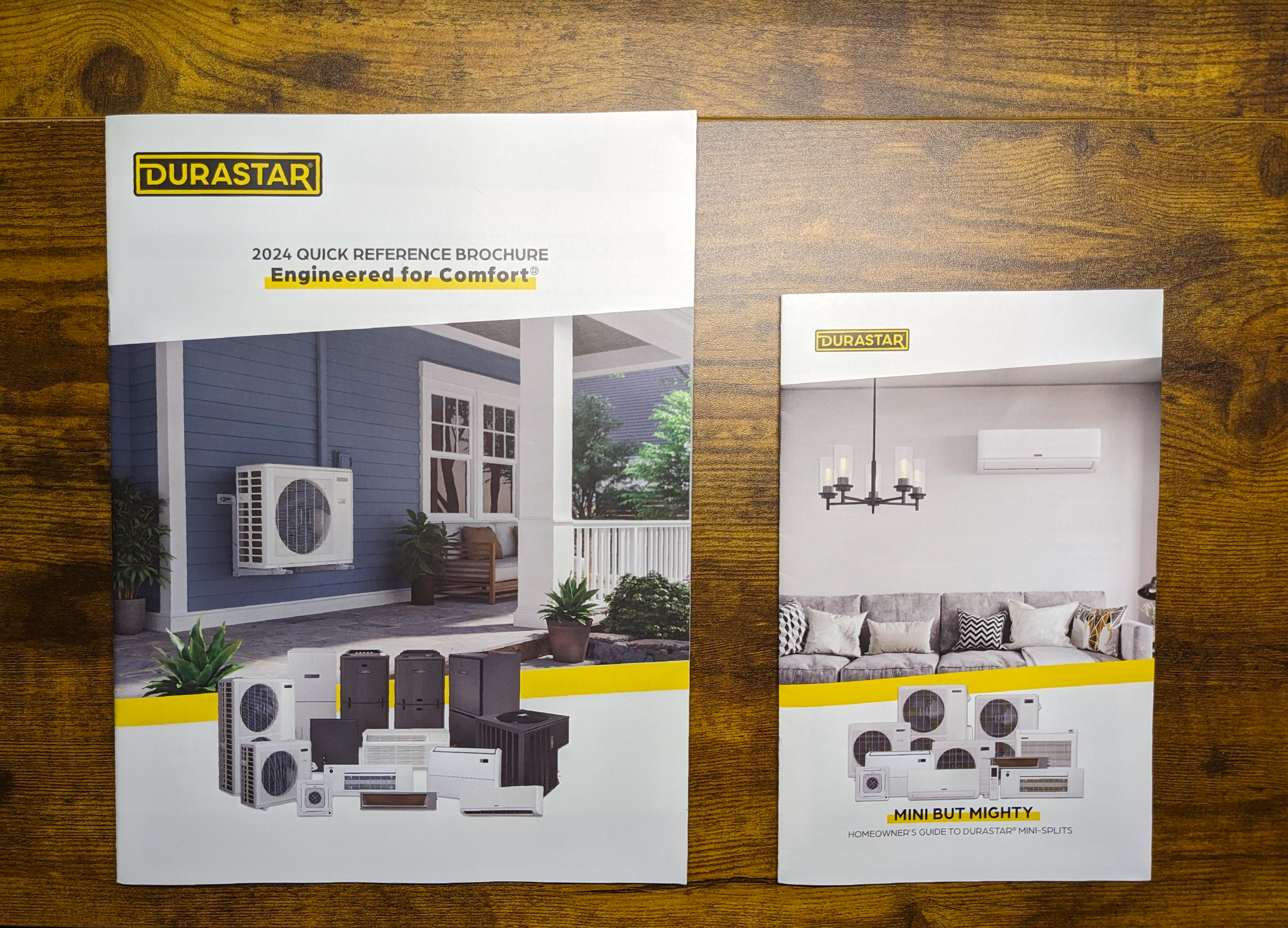
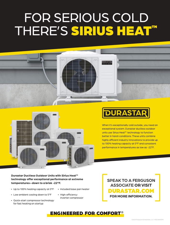
Durastar Full Line and Mini Split Brochures
These projects were a large learning opportunity for me coming from the digital world and with the completion of these projects we established brand guidelines based off of a lot of the design decisions within these deliverables.